One Day of Global Air Traffic
In the last decade we’ve seen the rise and popularization of crowdsourced web services and applications that gather and share real-time and historical data about the position of aircraft around the world. This includes services like Flightradar24, FlightAware, ADS-B Exchange, and OpenSky Network. This has been made possible thanks to the broad adoption of ADS-B technology in many aircraft all around the world and the accessibility and reduced costs of setting up receivers at home.
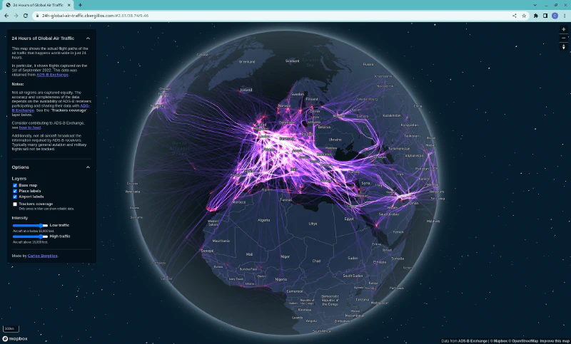
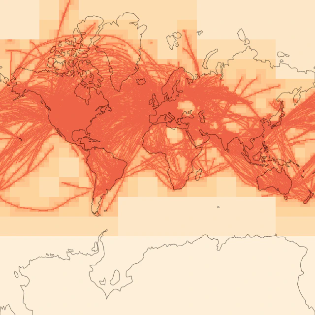
By combining and processing the data collected in one of these services we could try getting a picture of all the air traffic that happens around the world for a specific period of time. With this goal in mind, and using data from ADS-B Exchange, I created an interactive visualization of all the flight paths around the world that were captured in a single day.
Explore the interactive map at: 24 Hours of Global Air Traffic.
Obtaining the Data
The data for the aircraft tracks was obtained from the readsb-hist dataset from ADS-B Exchange.
This data is provided in the form of a series of JSON files,
each corresponding to a snapshot of all the captured traffic every 5 seconds.
With this, the data for a full day (in the highest time-resolution) is obtained by downloading and combining 17.280 of these JSON files, which account for a total combined size of around 15 GB when compressed and contain more than 200 million data points for the day I explored.
Cleaning Up the Data
The JSON files contain many interesting fields (full list here), but I was only interested in a few of these fields, like latitude, longitude, altitude, and aircraft hex identifier.
I decided to build a SQLite database to combine the data from all the JSON files to make it much easier to work with, and only keeping the fields I needed. I also filtered out many records, mainly filtering out traffic that was on the ground and filtering out airport ground vehicles. With this I ended up with a SQLite database of just 800 MB.
I made use of SpatiaLite in the SQLite database (similar to PostGIS for PostgresSQL). Its spatial functions and spatial indexes make it quicker and easier to query and transform the data.
Tiling and Rasterizing the Data
Most modern web map applications that cover the whole world use a system of tiles which divides the map into a set of square regions (or tiles) that seamlessly cover the whole world at different zoom levels. When a user wants to view a portion of the map, the browser only has to request the few tiles it needs to cover the area shown on screen at that specific zoom level, later requesting more tiles as needed if the user pans or zooms the map.
This way, even though the client viewport might need to display any arbitrary portion of the map, the region rendered is always obtained from combining and cropping a set of pre-defined tiles, which can be easily cached and re-used, and might have been pre-rendered and stored on a server long before.
For this project I decided to render my own custom tiles to contain and display this flight paths data. In particular I went with raster tiles (as opposed to vector tiles) since it proved more suitable for my use case. I want to always display all of the flights available, and therefore, a tile from the first zoom levels (corresponding to the whole world or big parts of continents) might contain hundreds of thousands of paths, an amount which is not manageable with vector tiles.
Each of the raw raster tiles consists of a 1024×1024×2 byte matrix. That is, 1024×1024 images with 2 channels per pixel. With each value being represented by one byte, allowing for values in the range 0 to 255 for the pixels in each channel.
These tiles are not regular RGB images, instead, they contain the raw information about the amount of times that each pixel was overflown by an aircraft in the 24 hour period. That is, a pixel with a value of 1 indicates that it was overflown 1 time (up to and clamping at 255).
Storing this raw information (instead of storing pre-rendered PNG images) allows for greater flexibility in the styling of the tiles later on, allowing to change how the tiles are colored on the fly (and even interactively) in the browser, without having to re-generate the original tiles each time.
Generating these raw raster tiles from the SQLite dataset of ADS-B flights is a somewhat computationally costly task, but once that’s done (and it only needs to be done once) coloring the tiles to obtain a nice visual image can be done very quickly by the GPUs in the client.
The first channel of the raw tiles is used to store information about air traffic at low altitudes, and the second channel is used for the air traffic at high altitudes. By having this information in separate channels we can treat them as separate layers and render them differently in the application.


Note: The brightness of the two raw tile channels as visualized above has been artificially exaggerated to improve their visibility. Each individual flight path only contributes 1/255 in value, but 1/255 in brightness would be visually indistinguishable from pure black.
Python and Datashader are used to easily and efficiently generate these raw raster tiles. The resulting raw tiles take up 2 megabytes each (1024×1024×2 bytes). Luckily these raw tiles compress very well since most of them contain mostly 0’s, so the final file size of the tiles is much smaller. The average file size of the tiles after using simple gzip compression is just 16.65 kilobytes (0.81% of the original size).
I experimented with different sizes (resolution in pixels) for the tiles, such as 256×256, 512×512 and 1024×1024 (always with 2 channels), but ended up settling with 1024×1024. The larger the tiles, the fewer tiles are needed to cover the same area with the same level of detail. Fewer files are easier to work with on file systems, and they result in fewer requests over the network to the server. On the other hand, larger tiles mean larger file sizes, potentially resulting in longer times until data can get drawn on-screen in the browser. But, as mentioned earlier, the file sizes of these tiles when compressed are still very far from being an issue at a 1024×1024 resolution.
Generating the Tiles
Tiles can typically be either pre-generated and stored to be later served as static files by a simple web server, or alternatively, they can be generated on-demand by a dedicated tile-rendering server. Most web map providers use a combined approach using both on-demand tile generation and a layer of cache to stores and reuse the already generated tiles for some period of time.
In my case, generating the raw tiles for the first zoom levels (and other zoom levels around busy airports) can take a few seconds on an average computer. While being a short time, that is still not short enough to be able to provide a good real-time user experience by generating all the tiles on-demand.
I expect most of the interest from people viewing this flight paths map will be focused on viewing large regions of countries and areas around airports, and I consider providing tiles for very high zoom levels (at street-level scales) is not as important. I therefore focused on providing tiles only for zoom levels 1 to 12. At these zoom levels pre-generating and storing all of the tiles is a manageable task.
Note: In fact only tiles up to zoom level 10 were generated, but these tiles at a 1024×1024 resolution are equivalent to using tiles up to zoom level 12 at the standard 256×256 resolution.
By pre-generating all of the tiles I can also save costs by not requiring a dedicated backend server working. Instead, the only thing required as a backend is a way to serve a bunch of static files (the tiles), which will always be much cheaper and easier.
Additionally, I didn’t have to generate and store all of the possible tiles since most of them would be all empty without a single crossing flight. Tiles were generated recursively, starting with the first zoom level, and only generating “child” tiles of tiles that were not empty. With this, only 20% of all the potential tiles ended up being generated and stored. All other tiles were known to be empty.
The complete tile generation process took 2 hours and 55 minutes in a relatively modest Intel i5-4690K @ 3.50GHz CPU with 4 cores and 16 GB of RAM. With the final resulting set of raw tiles (individually compressed) taking up 4.6 GB in total.

'used' columns) compared to the theoretical complete set of uncompressed tiles ('full' columns) as well as the reduction achieved ('%' columns, calculated as: 100*used/full).
Drawing the Map
In order to render the final map in the browser I decided to use the Mapbox GL JS library.
It uses a modern vector tiles approach, allowing, for example, to draw place labels above the custom flight paths layer.
And interactively toggling on and off any of the layers.
Additionally, its pure WebGL rendering pipeline was fundamental in order to easily integrate the rendering of my raw tiles in this pipeline and to efficiently render them using the GPU.
As an extra bonus, Mapbox recently introduced a fantastic new 3D globe view providing a much more realistic and distortion-free view of the world at low zoom levels.
Unfortunately, Mapbox GL JS does not natively support rendering of tiles using custom WebGL shaders. It does have support for custom WebGL layers, but this approach would require me to re-implement the whole tiles requesting and caching mechanisms myself. Additionally, these custom layers do not currently work in the new 3D globe view.
For these reasons, I ended up making my own custom fork of the Mapbox GL JS library to support my very specific use case.
After all, Mapbox GL JS already provides all of the pieces required to request, handle, and render raster tiles,
but instead of using the included shaders which expect regular RGB images (like satellite images),
I am using my own new custom shaders that correctly interpret the 2-channel raw tiles and render and style them appropriately,
always using the GPU via WebGL.
As a last step I also had to create and expose a custom internal interface in order to allow tweaking the behavior
of these shaders interactively in the browser.
This is what allows, for example, to modify the intensity of the low and high traffic channels in real-time from the options panel.
Similarly, it would have also been trivial to introduce a way to change the color of the paths in real-time
(psst, try changing the value of map.getLayer("flight-paths").c1_color and c0_color from your browser’s console).
Acknowledgements
Some of the methods and motivations for this project were inspired by the work of the Strava global heatmap as described in: Building the Global Heatmap.
This project would not have been possible without the data obtained from ADS-B Exchange and shared by all of the feeders collaborating. Consider contributing to ADS-B Exchange, see how to feed.
Images
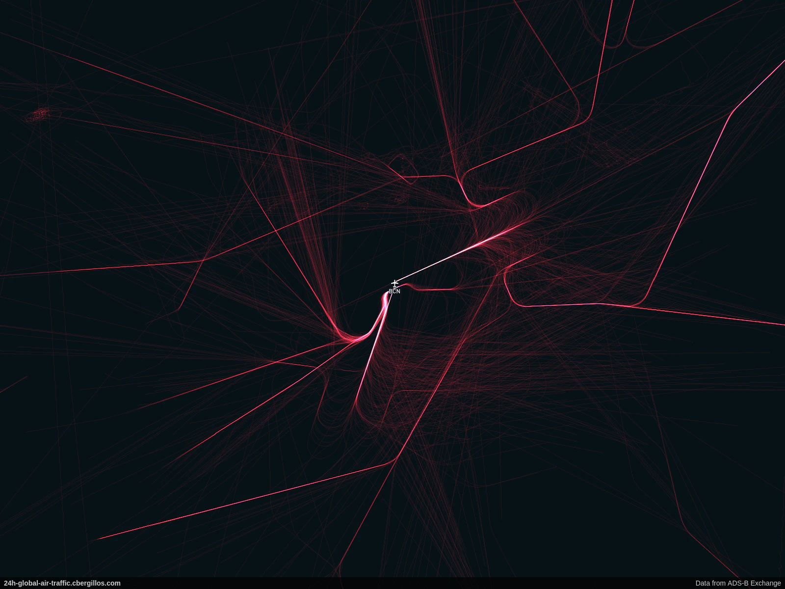
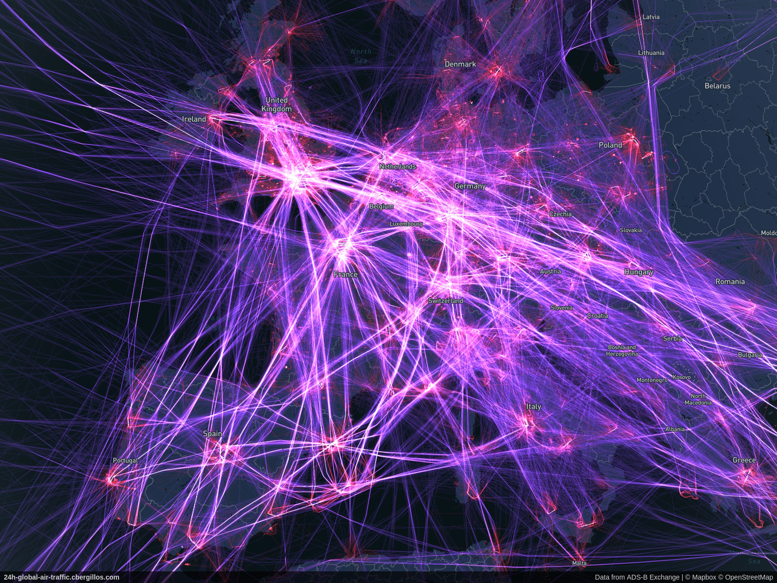
All of the following images were captured using the public website presented in this blog post.
Europe
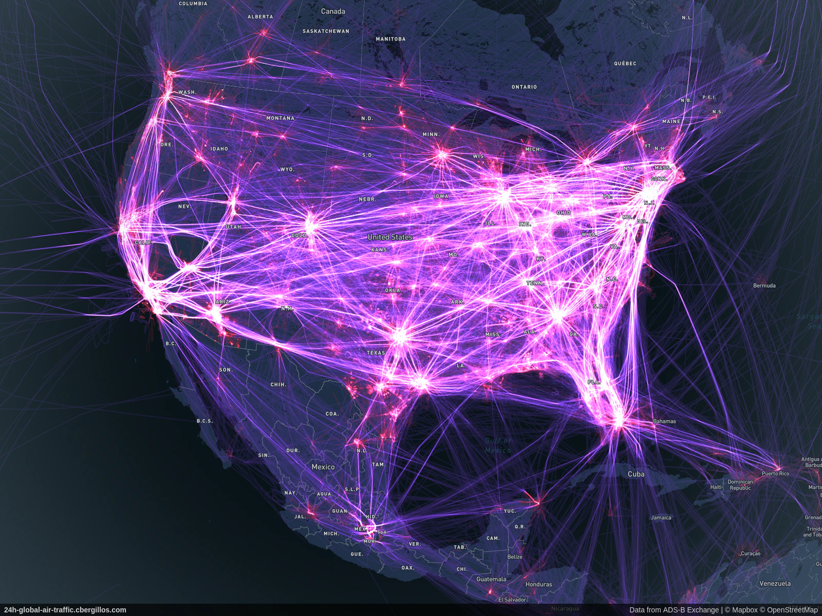
North America
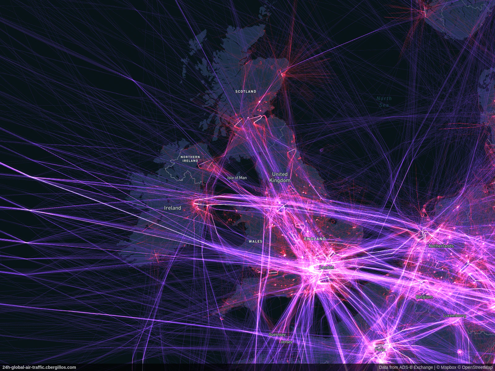
United Kingdom
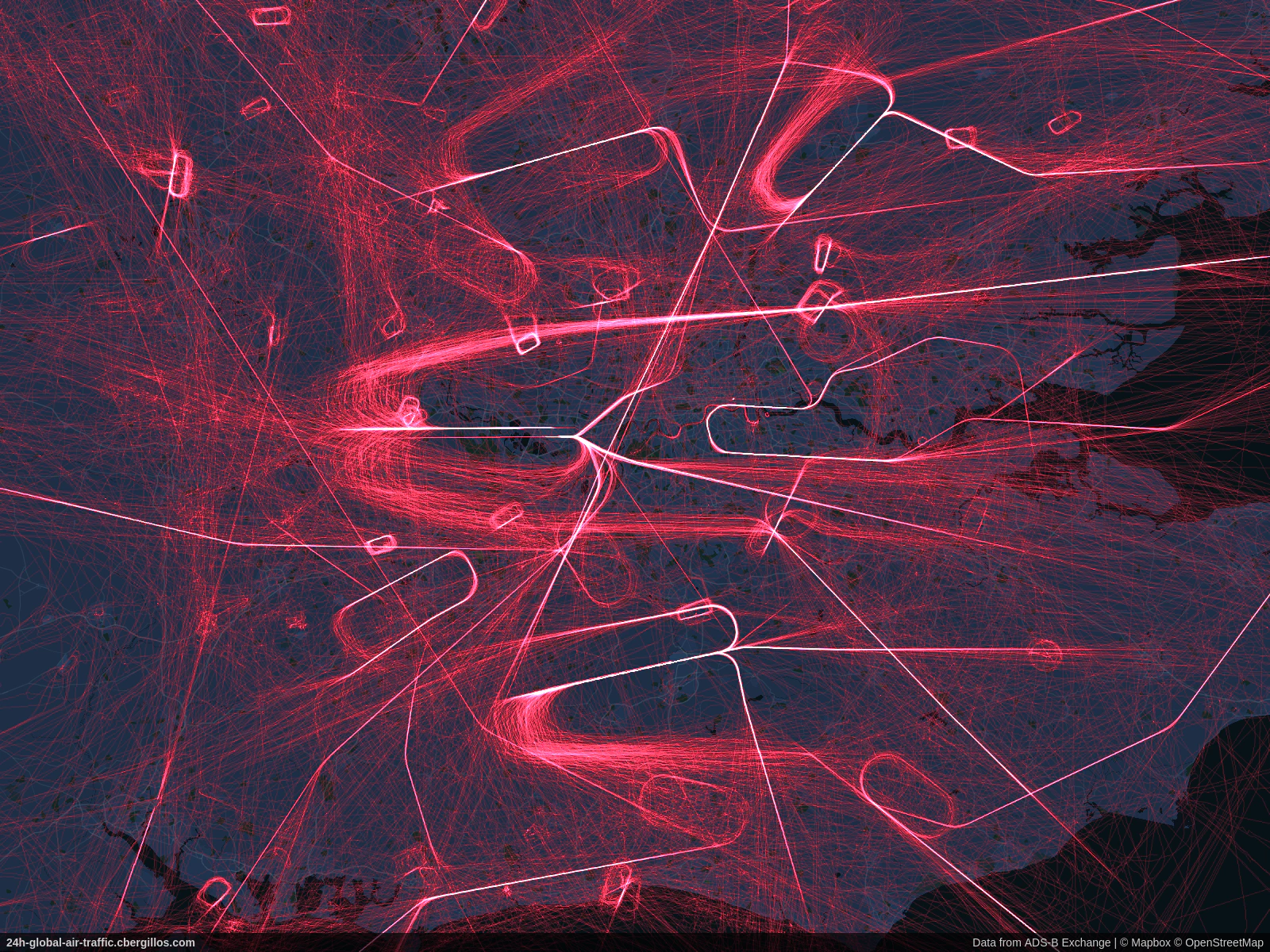
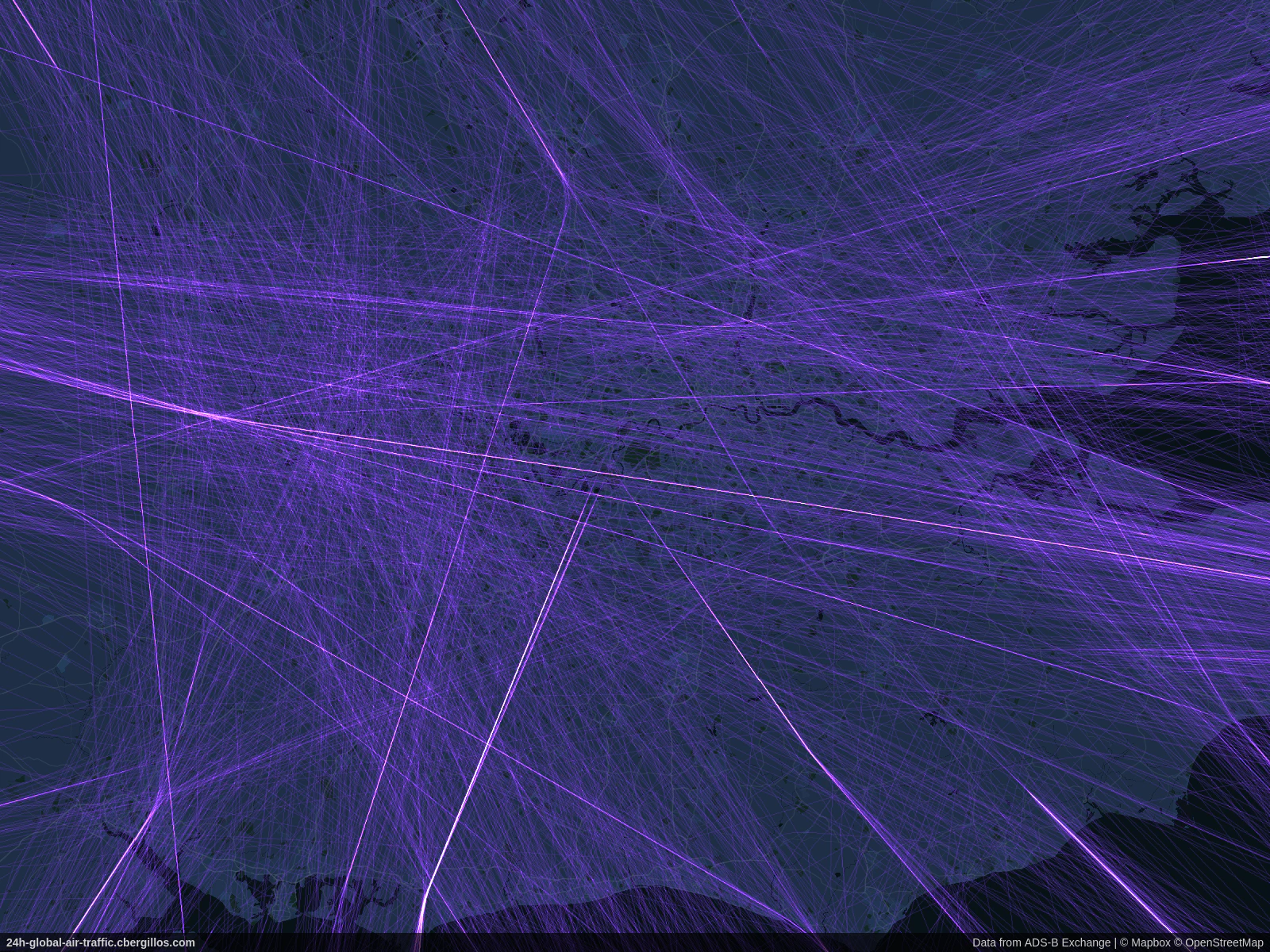
London, UK
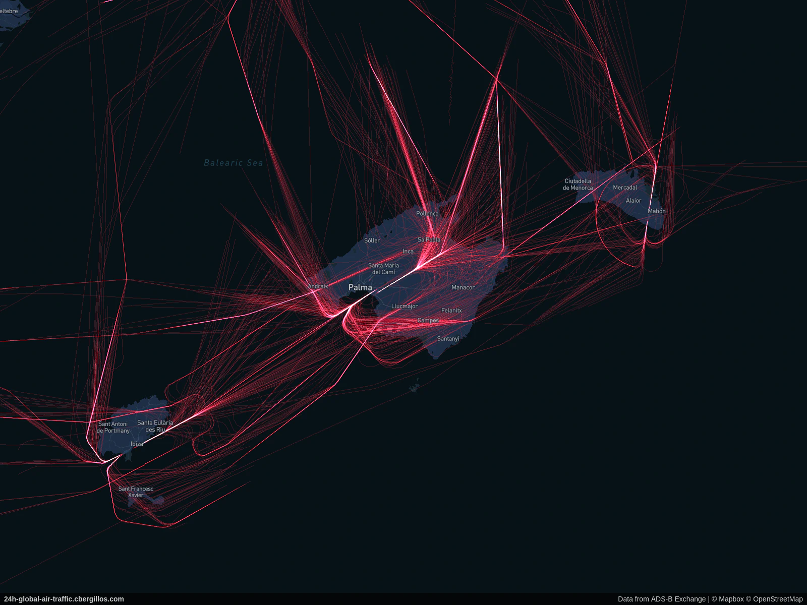
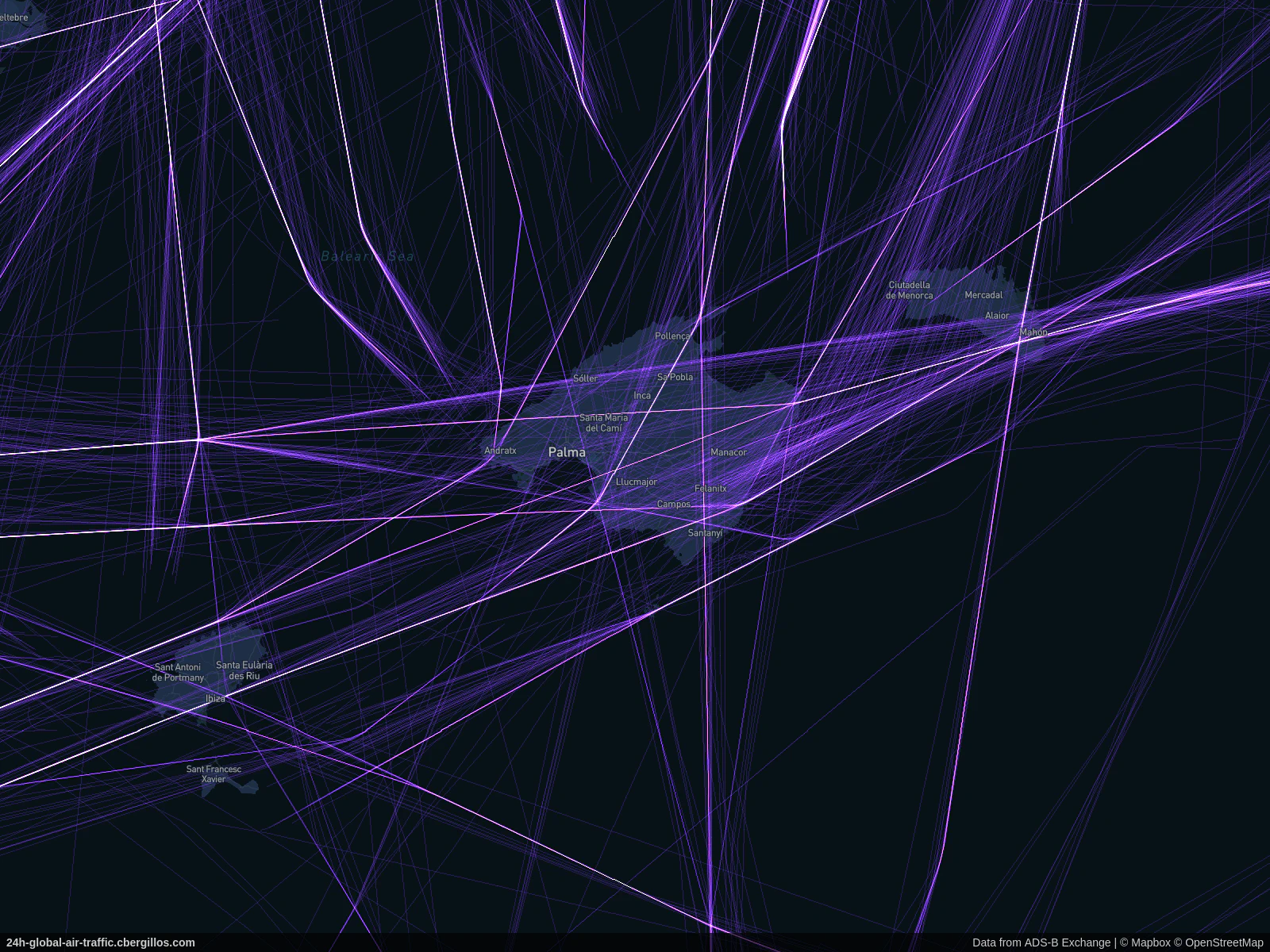
Balearic Islands, Spain
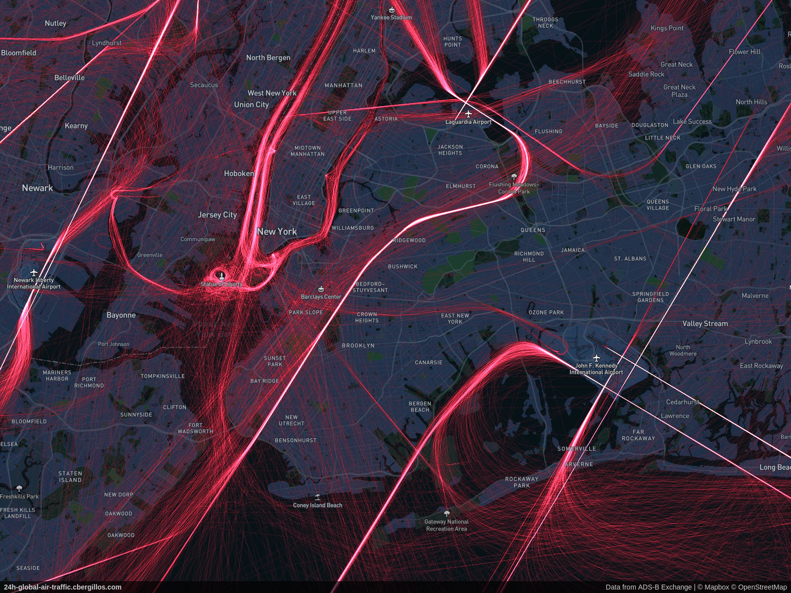
New York, USA
Chicago, USA

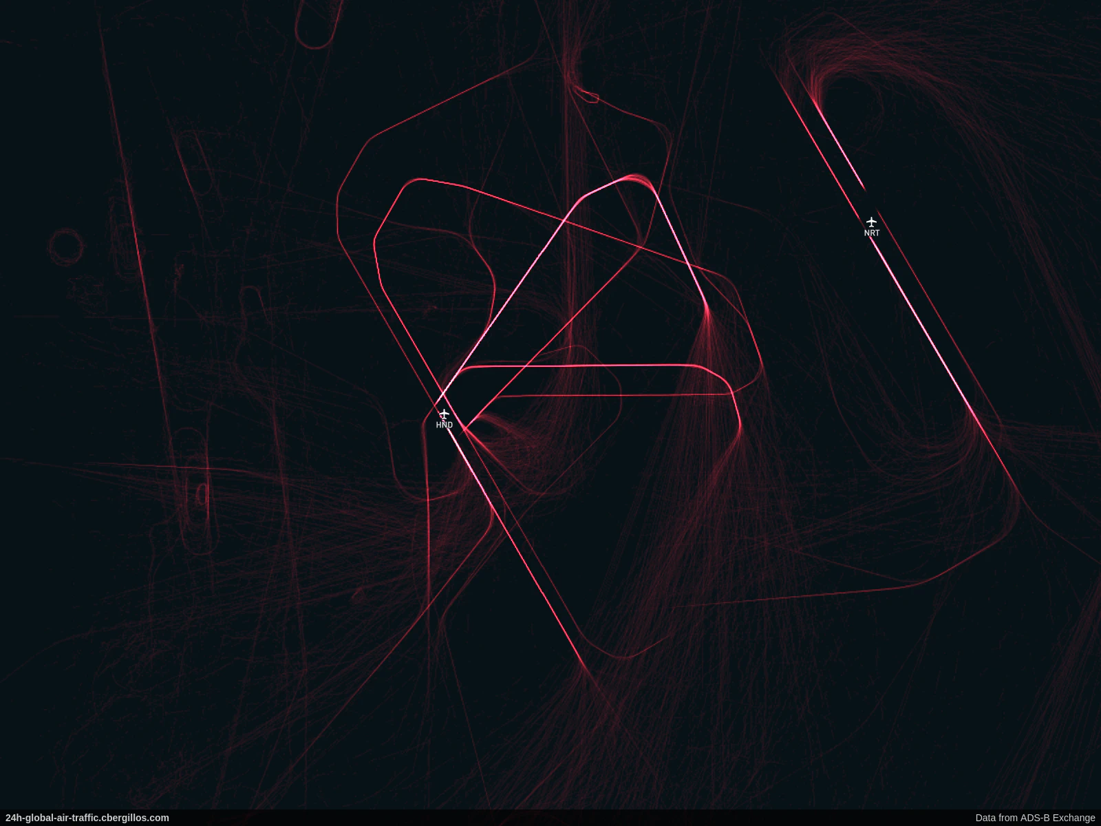
Tokyo, Japan
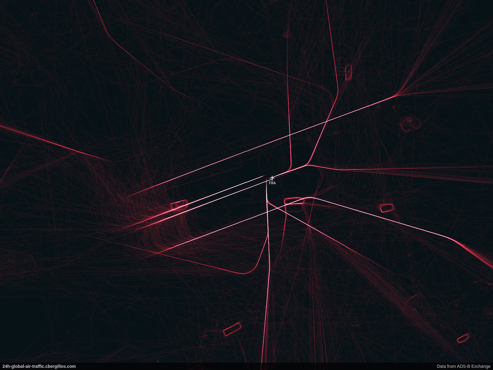
Frankfurt, Germany
Barcelona, Spain